Disney

Walt Disney was an inspirational icon in the business world. He started his move making profession by establishing the Laugh-O-Gram Studios, which went bankrupt in 1923. Bouncing back from this let down, Walt Disney went to Hollywood to start over. His creative attributes drove him to create two established characters, Alice and Oswald rabbit. Utilising these characters, Walt invested hours upon hours establishing short animations that turned out to be very popular and successful. Unfortunately though, Walt lost his right to his characters because of lack of copy write in 1928. Though facing failure after failure, Disney grew in ambition and determination. Again, Walt invested into yet another character called The Steamboat Willie cartoon, and this was an instant hit. This cartoon mouse would later become known as Micky Mouse. Because of his success, Walt Disney Productions was formed in 1928. Only after many years of establishment, 1978, Disney's first logo was produced. This logo was know commonly as "neon micky' and would change colours creating a 'techno' effect that was very advanced for the times. This first logo, was bright and fun, capturing the heart and feel of Disney right from the start. The techno look also paid attribute to the professional animation and movie making technology that Disney was incorporating to make their films look exceptional. The logo enticed the audience of the quality of their films, before people had even watching a single frame of Disney's animations. The logo consisted of a silhouette of Micky Mouse, a character which had been well thought about and developed with greater artistic shape and topography. By show casing this character in the logo, it attracted a market unfamiliar with the character whilst also reminding others of the rambunctious, dramatic, fun loving character that soon became a world wide branding image. The silhouette was made to pop by incorporating several subsequent outlines that grew in size (see above image). This gave the logo an illusional appearance, that captured the wonder that Disney is know to evoke.

In 1995, the logo went through a transformation .
Coming up with such an iconic image of Cinderella's castle would have required lots of time and money to hire skilled graphic art designers. Such artists would have experimented with the tone, colours, lines, shapes and form which assemble to conjure up highly striking emotive image. Castle's themselves conjure up a manifold of feelings such as history, romance, mystery, wealth etc, however castle's always seem to connote sweet, aesthetic pictures.
The star that seems to fly over the castle brings up fanciful, images of a clear night sky, as well as linking to the fanciful idea of wishes coming true. This sense of magic we receive awakens a creativity and imagination, as we yearn to experience the wonder of Disney's magical story lines. As a big part of Disney's success on its state-of-the-art graphics, it was important to have a logo that lives up to their reputation. Hence why this simple 2D logo incorporated and emphasised smooth movement of the sparkling, shooting star.

In 2006, Disney changes its logo once again, changing with thetimes to produce yet another graphical /technological masterpiece. Through this intricate, extravogant castle, it makes the audience wish they could experience such a magical place, explor the luxurious castle, and imagine getting caught up on exploring the many rooms, halls and a ball rooms. Through including many 27 towers, balconies, windows and even a moat, this inticate image commands the eyes of its audience. A lot of attention has been given to the font used to spell out the word “Walt Disney” as well. Since the castle itself is so complex, the font of the Walt Disney needed to be bold and easy to read whislt still portraying the wimsical feel of Disney. Disney came up with a font that was high differentiated and acted as a unique branding image that was recognisable and distinct.
Paramount

Paramount was founded in 1912 W.W.Hodkinso. The Ben Lomond Mountain in the logo was a significant landmark in Hodkinso's childhood. The fact that the logo was formed from fanciful childhood memories connotes to the magical/ serial Paramount movies and a sentiment to small beginnings. This logo is now know as the 'mountain of dreams', starting off as a mere doodle drawn up on a napkin.
The 24 stars in this logo were incorporated to pay homage to each of the original actors in the original production. As the number of contracted actors varied from movie to movie the number of stars was altered to fit. These celestial icons give the company an 'out of this world' appearance.
Being the second oldest movie studio still operating, Paramount has kept the image of their logos very iconic, keeping their font, and their image of mountain rising through the clouds remaining very much the same throughout the years. Such brand recognition is very important for any company. In doing so ggenerations will be able to recognise this well banded logo/producing studio that has produced a collection of blockbuster hits and critically acclaimed movies. Paramount Pictures has gone on to be a big name in the world and continues to be a leading producing studio. This original ominous black and white logo brilliantly enraptured the sinister climate of Paramount's initial films such as: Manslaughter 1921 and Blood and Sand 1922. The bright bold font pops out from this dull background, emphasising and drawing the eyes of their audience to the studio name which was a key benefit to the success of the brand. By attracting their audience to the name of their studio, more and more people actively watched other Paramount movies.

The second logo was transformed and improved by a serene array of sunset colouring's, and a more aesthetic composition, which included more of the mountain and its background. This bespoke of the companies ability to transform with the technological times.The maroon rays of the sunset compliments the rich marine blue of the sky whilst also linking to the themes of bloodshed infiltrating many of Paramount movies. This logo also was painted by the studio’s chief painter on the 75th anniversary of the company in 1987, by artist Dario Campanile as opposed to the original logo which had been created using filming techniques. another significant change was made, removing the word picture. By simplifying the writing to just one dominant word: Paramount; it focuses on the most important message, helping the audience remember the studio's name.

The transition to the newest logo to date, was minimal. The mountain scenery remains almost exactly the same, as well as the word Paramount and the stars. The inclusion of clouds in the mid section of the composition adds a more softer feel to the logo. This was necessary when Paramount launched a newer market to a younger audience; producing movies such as Rango, Charlotte's Web, Shriek and Madagascar compared to a primary focus on action and thriller blockbusters such as, Transformers, Titanic, Iron Man which were targeted at more senior audiences. This logo had also changed from a classic piece of artwork- a painting, to a more modern piece of art created on CGI graphics. This time though, instead of a 2D static image, the logo took on a new 3D moving characteristics. The camera follows the movement of one of the starts which creates spirited movements up to the top of the mountain. In doing so, it grasps its audience with vigour and action, whilst also emphasising the height of the mountain peak. The music starts off with rich trumpets that build and come to a grand crescendo as a whole orchestra resonates. This monumental noise manifests Paramounts prestiege.
Universal

Universal, the oldest studio in Hollywood, was founded by Carl Laemmle. In being a successful manager, and fascinated by the nickelodeons, purchased into them and subsequently invested into other movie making studios that lead him to founding of the Universal Motion Picture Manufacturing Company in 1914. The first logo resembled a globe that had the resemblance of Saturn. The original logo was ingenuitive, created from models before 1997.

This is the classic 1930's logo that helped greatly to made Universal iconic and widely known. This logo was seen at the begining of classic monster movies of the day.It's dark, cloudy, ominous setting set the sinister climate of the thrilling movies, and was therefore remembered as part of the film. A lane flys around the plannet as the words 'A Universal Picture' fades into scene. This slow fading image adds a stealthy feel, while the roaring of the plane adds a mechanicle coldness to the logo. Universal has produced many different logo's throughout history, addapting cirtain elements to set the climate of each movie. In doing so, their versatile approach keeps the audience interested in their logo's which also creating a brand label by keeping cirtain elements the same. For example, they have always incorporated a planet with words including 'universal' spading its circumference/width. The vidio bellow shows the Fast ans Furious editon of the logo:

The new logo looks stronger and more effective by the bold metallic letters. The effectiveness is probably achieved by a more realistic looking Earth, space environment surrounding it, and the eclipse of the Sun, opposed to the “glow-effect” the previous logo had. Weta Digital, a visual effects studio based in New Zealand. The visual dynamic of the new logo was inspired by satellite imagery that illustrated a view of the world on a clear night from space. Rather than focusing on the continents and physical boundaries that separate people, such as oceans and countries, the new view is highlighted with tiny points of bright lights that pop across the globe symbolising the thousands of communities brought together by their shared love of film.The award-winning film composer Brian Tyler, revitalises the classic soundtrack of this logo claiming, “We wanted to utilise the classic melody that we all know and bring it into the 21st Century, while still being very respectful of what Jerry Goldsmith did originally. I wanted it to be a celebration of all the great movies Universal has done over the years— connecting the past to the present.”
20th Centery Fox
(History and Ownership)
The studio has its corporate headquarters in the Century City, Los Angeles, hence its name '20th Century Fox''.The company's origins started back in 1904 when William Fox, began distributing films, and soon started producing his own in 1913. In 1915 he moved his studio from New York to Los Angeles and named it the Fox Film Corporation. Years Fox struggled with the finances of the business, and having borrowed heavily to finance these moves on the eve of the Great Depression, Fox lost control of his company in 1930. In 1933, Twentieth Century Pictures lead by Darryl F. Zanuck (who had quit as head of production at the Warner Brother's studio) merged with Fox Film Corporations, changing their name to 20Th Century Fox as we know today. The acquisition of 21st Century Fox by The Walt Disney Company took place on March 20, 2019. Among other key assets, the acquisition included the 20th Century Fox film and its' television studios. Comcast (parent company of NBCUniversal) made its own offer of $65 billion cash to acquire the Fox assets that Disney was set to purchase. This initiated a major bidding war between the two companies. Disney won the bid with the final offer of $71.3 billion. Now Twentieth Century Fox runs underneath Disney as a holding company.

The originally Logo was created in 1935 designed by the special effect animator and matte painting artist Emil Kosar. This graphic emblem was technique of Art-Deco ( sleek and anti traditional elegance that symbolised wealth and sophistication), which this gold stupendous monument certainly contains. Oregionally, the logo was created as a matte painting on several layers of glass and animated frame-by-frame. The low angle it is presented at, emphasises the statues magnificence and magnitude, elevating the logo and the company retrospectively. In 1953, Rocky Longo was hired to recreate the original logo design in the new CinemaScope process. CinemaScope ratio of screen composition that made the width of the screen two and a half times longer than the length (anamorphic). This meant that films could be easily screened in theatres requiring only a lens adaptor. This technique was created by Spyros P. Skouras, the president of 20th Century Fox, and marked the beginning of the modern anamorphic format in both principal photography and movie projection. This technological development was incorporated into the logo, advertising 20th Century Fox's worldwide leadership in contemporary, technological, innovations.

20th Century Fox's fanfare (a short ceremonial tune or flourish played on brass instruments, typically to introduce something or someone important) was originally composed in 1933 by Alfred Newman. Its simplistic tune was created to be recognisable and iconic. The addition of drums art the end of the logo gives it a more polished and extravagant sound.
The spotlights that 20th Century Fox includes, are almost iconic as the monument itself. They represent entertainment, and the history of movie making. Their round circular shape parallels to a camera lens. The logo is made to look as appealing as possible including palm trees, a sunset, an intricate base to the monument and a thriving city that lies on the planes bellow. The colour purple is excentuated in the sunset, a rich colour conoting to wealth, and fame. The soft pink hues give it a warm, family focussed, unifying approach. The city symbolises how humanity has thrived and supported 20th Century Fox, elevating it to where it is today. The fact that the monument lies above this thriving civilization emphasises the achievement that they have reached. Such achievements include producing the highest grossing film in history, Avitar, as well as other blockbuaters including, Titanic, Deadpool, Star Wars, Night At the Museum, the list goes on.
Legendary Productions
(History and Ownership)
Legendary is a newer production company that originated in 2000, founded by buisness man, Thomas Tull. In 2005, Legenday became a production and financing partneer with Warner Brothers producing the film Batman Begins. After their contract ended with Warner Brothers, a similar contract was issued with Universal Pictures. Legendary was purchaed by Chineese congglomerate, Dilain Wanda Group in 2016.

Legendary Pictures first logo of a sword, encapsulates and emphasises the word legendary, giving it a more historical, mythical approach. Legendary's logo are know for their simplicity, which goes against the grain of common logo such as all the ones mentioned above which are visually, much more stimulating. By contrasting the norm, Legendary produced a logo that was striking, effective and memorable. In merging the L in legendary with the hand grasp of the sword, the company makes itself know as intelligent and visually creative. The gold symbolises the quality and demand for their movies.
Legendary's newest logo, keeps its iconic simplicity, whilst transforming it's image entirely.The Legendary logo is based on the Celtic “Shield Knot”. This Symbol dates back to early Ireland history. It symbolises eternity, fidelity, and unity (through the seemly unending network of lines) . According to myth, Celtic warriors associated it with protective spells invoking the gods of the four corners of the earth. This new logo had the same fictitious and historical qualities.
The fanfare behind this logo is also very unorthidox. Instead of a grand orchestral accompliment, the ambiance of a deep metallic sound is heard.
The logo seems to steem as it is welded and burnt. It glows red with heat, as the sold metal is carved ontop of a black background. The image is bold an essenteric, giving the audience the feel as though the movies that Legendary is stable, strong, and well stablished. It also sets the audience into the climate of Legendary films, ominous, action packed, and mythical. Legenday films include:
The Dark Night, Trick 'r Treat, Inception,Where the Wild Things Are, Ninja Assassin and Clash of the Titans.
Our Own Logo
Begining stages
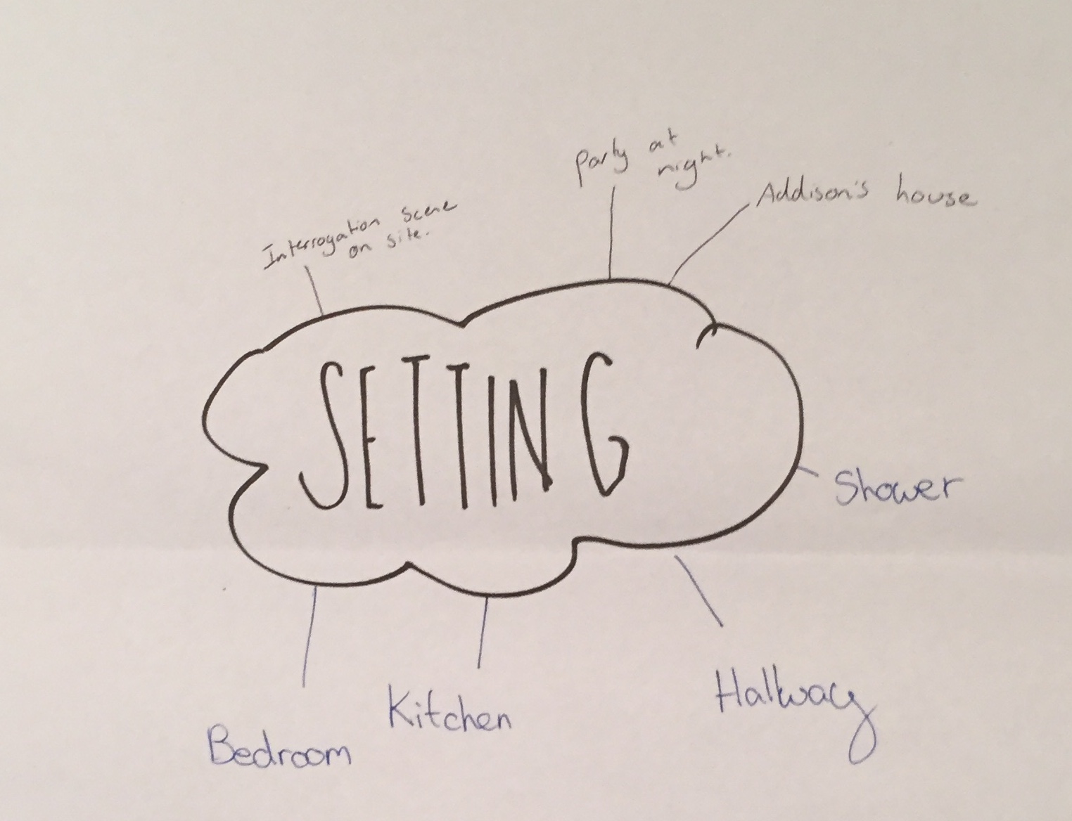
In designing or logo, Addison Saxby completed some research into different logo types. We narrowed down our options to two. The first template showed a picture of a city, through a rain soaked camera lens. We decided it wasn't the best option for AGE Productions (our producing name) because, the majority of our films were shot out of Urban areas, in more desolate locations and therefore a city did not depict the overall climate and setting of our productions. Also the bright, glowing logo that it featured gave a modern, feel, which connotes to civilisations accomplishments, advancement, structure, and order which we aim to oppose in our films (with the incorporation of uncivilised violence, and legalised guns etc.). The logo would have looked some what like this:

Our second option exhibited an old scratched wooden template, with woods being burnt into it, appearing glowing red. The logo is 3D and camera movements carve in zigzag movements down and up the wooden board as the words are burnt into frame. We decided to go ahead with this template for several
Reasons:
-Firstly, the old vintage style of the template connotes to ancient times. History is associated majorly with war, and gory battles, such as the World Wars, the Cold War, as well as Mythological tales of worriers, and cavalry such as the Mythological tale of Author of the Round Table. The aged look undergirds our name AGE Productions.
-The wooden board is clearly aged with scratches, nooks and stains, which creates a sense of enigma to what has happened to it as well as foreshadowing of action which we incorporate in all our films.
- The words AGE Productions will be burnt into the wood, appearing bright red before morphing into black. This bright red glow is an iconic motif in our films, that is used to emphasise stress, and blood,and heat. By incorporating it into our logo, we create another opportunity to add suspense and whilst creating a repeated icon in our films.
- Addison Saxby is experimenting with the camera movements of the logo following the writing of the letters AGE Productions. We discussed having the camera movements fast and action packed tracing pathways all around the wooden board (flowing from all four sides and corners of the board). These camera movements foreshadow the action in the film, link to the various quick cuts, and grasping the audience through a stimulating, mobile/operating logo.
- Quick movements are also incorporated into the carving/burning of the letters. The motions are rapid and sharp, mimicking the motions of swift slashes of a knife. This heightens suspense from the very start of the film, setting the climate of our signature thriller-genre movies.
- The font still playing with however I imagine it to look somewhat like the picture bellow. Artistic, creative, and aesthetic which sets up our film in a positive light before the very first frame. The other option we were thinking of as a group is a font that is very rigid and sharp parrallelling to the carving motion of the wood. Like this:
This is what the template for our design looks like:

Emblem Creation
After brousing on the internet for inspiration, Addison Saxby came up with the idea of incorporating an emblem/symbol of two jousting horses. After opting to complete the drawing of our jousting ideas, I reseached many images and got my inspiration from two key photos:


In drawing the logo I came up with this design:
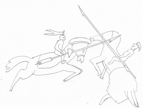
Subsequently, after handing this to Addison to incorporate into our chosen template, we faced some technical difficulties, and I was ask to recreate the image more simplicity and in bold black blocks.
I then came up with this illustration:

Reasoning Behind Our Emblem
- The icon of jousting horses dates back hundreds of years, and links hand in hand with the aged look of the wooden board template, as well as our name AGE Productions.
- Horses can be a vicious, wild, unrestrained animal which parallels to the wild, vilent, fiendish nature of our villains. The viollent action of jousting also pertains and foreshadows the action in our films.
- Jousting nowdays is a sport/hobby, and this links to the entertainment factor that our film entails.
- Jousting in ancient times was held between two opposising sides, and in jousting movies such as, A Night's Tale (2001), against good Vs bad/ hero Vs villain. Already from viewing our logo, our audience will percieve the coming coflict in polar characters, a convntion we make frequent use of.